
Open Books
2026 | 12 Weeks | Exploring Identity
Open Books is a brand designed to encourage young people to discover and enjoy books that they love, building their confidence, encouraging reading habits and positive experiences with libraries.
Research
This project was heavily fuelled by research, which contributed significantly to determine a target audience. Interviews and observations across libraries and competing environments showed a clear a decline in reading and library engagement among young people aged 18–24. This highlighted the opportunity to make reading more accessible and appealing to this audience.
Defining my target audience and brand identity early on allowed me deepen my research through competitor analysis and case studies of Goodreads, Quick Reads, Kindle and Duolingo. These insights highlighted the importance of creating a playful, intuitive and engaging user experience, with friendly tones shown through branding and visual identity. These findings played a key role in subsequent design choices, ensuring that user needs had been investigated and considered throughout the project.
Brand Development
Open Books is a conceptual LibrariesNI sub brand, with the goal of to creating a welcoming, personal experience that encourages young adults to get into reading. Establishing a strong mission statement and values are a pivotal starting point of brand development, it makes a brand come to life. I wanted to truly capture my personal intentions and passion in Open Book’s brand and create a connection with the target audience.
“Open Books mission is to encourage young people ages 18-25 to discover and enjoy reading books that they love, building their confidence, encouraging reading habits and positive experiences with libraries.”
Brand Identity
The name Open Books was chosen to create a fun connection between the brand’s mission of encouraging young people to read, and the physical act of opening a book to read. This straightforward approach feels books at the focal point, and creates a memorable and accessible identity.
Colour
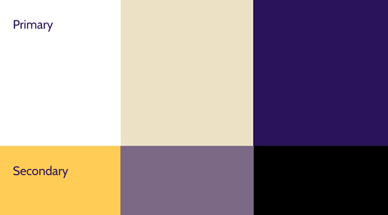
The colour scheme consists of white, beige and dark purple. The lighter tones of create clarity and a welcoming feel, while dark purple provides contrast and sophistication. Together, these excellently contrasting colours support Open Book’s branding and support a consistent visual identity.

Typography
I selected ‘Cabin’ as the primary typeface. I always strive to ensure accessibility so that a wide audience can easily get involved, and supporting readability is a good building block to inclusivity.
Mobile App
Designed to create an accessible and enjoyable library and reading experience, the Open Books app interface reflects the needs of users and aligns with brand identity. Every component, icon and visual element was developed specifically for this interface, creating a cohesive interface.
My aim was to prioritise functionality and usability without minimising the focus on the actual books, at they are the central focus on this project. I aimed ti create an inclusive and personal experience that encourages users to step into reading in a way that best suits them, without being overwhelming or demanding.
Prior to developing the interface, I conducted initial UX Teardown before designing the app interface, investigating existing competitor apps’ strengths and weaknesses. This contributed greatly to the development of sketches, as aspects of these were key for inspiration.
The Open Books app has a wide range of features that create a welcoming, smooth experience for users. Recognising that every young person has their own unique goals and habits when it comes to reading led me to focus heavily on personalisation options that tailor to a wide range of users. This ensures that getting into reading seem achievable and manageable at a pace that is comfortable to the user. The Home Screen supports this by showing the users current book that have taken from the library, highlighting their progress to encourage staying on track and motivation.
Landing Page
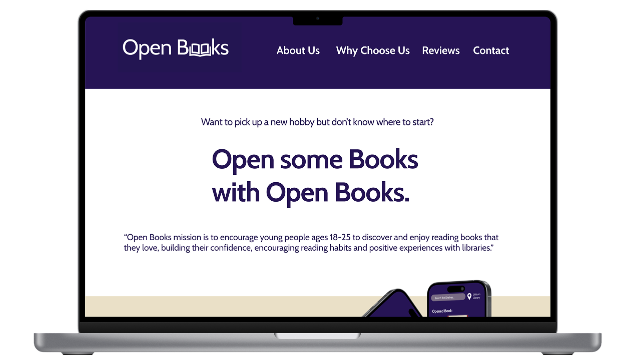
Open Books’ landing page keeps a consistent appearance with the app interface, using consistent colours and typography. It clearly reflects everything Open Books has to offer for users, clearly showing key features the app has to offer, positive user feedback, showcase of popular books to really show users what it can bring to them. It is also bright and airy, creating a welcoming and approachable landing page that encourages users to explore further.
Brand Guidelines
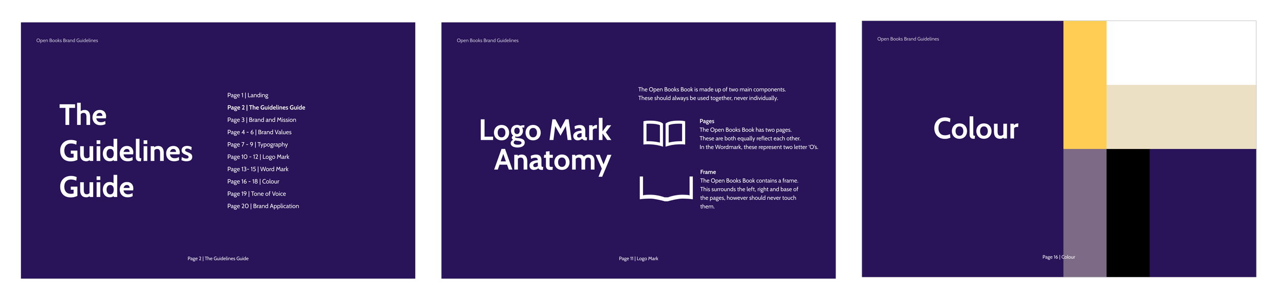
The Brand Guidelines effectively capture what Open Books is all about, bringing together all aspects of branding into one cohesive document. I wanted to create something extensive and detailed for this. It established various aspects of branding, ranging from the brand values and mission statement, to visual identity such as logo and colour scheme. Each aspect of branding is explained got ensure clarity about all design choices and an insight into the thinking behind each decision. The guideline makes it clear each element how each element is to be used and how aspects of Open Books’ brand identity work together to create a coherent, successful brand. Providing this clarity ensures that all current and future Open Books’ touchpoints remain consistent in visuals and align with the rest of the brand.
Reflection
This project allowed me to tie together my knowledge of branding and UX design together to create a cohesive brand identity and user experience from start to finish. I focused heavily on creating approachable and welcoming touch points that encourage users to build positive reading habits. Through this project, I have deepened my understanding of user-centred design and how to communicate brand identity through consistent visual elements and thoughtful design decisions.
In future, I would love to develop this project further to cater to wider scope of audiences including children and a wider range of adults. Bu making Open Books engaging for a wider demographic of people, I would aim to encourage a much greater increase in the participation of reading and engagement with libraries.
Read more about the process in my project blog.